Softavera · Product
Anatomy of a White-Label Kiosk
How a WinDev application became a React platform that each brand configures itself: its identity, its journey, its catalogue and its shops.
 Kamel DhakwaniProduct leadership · UX/UI
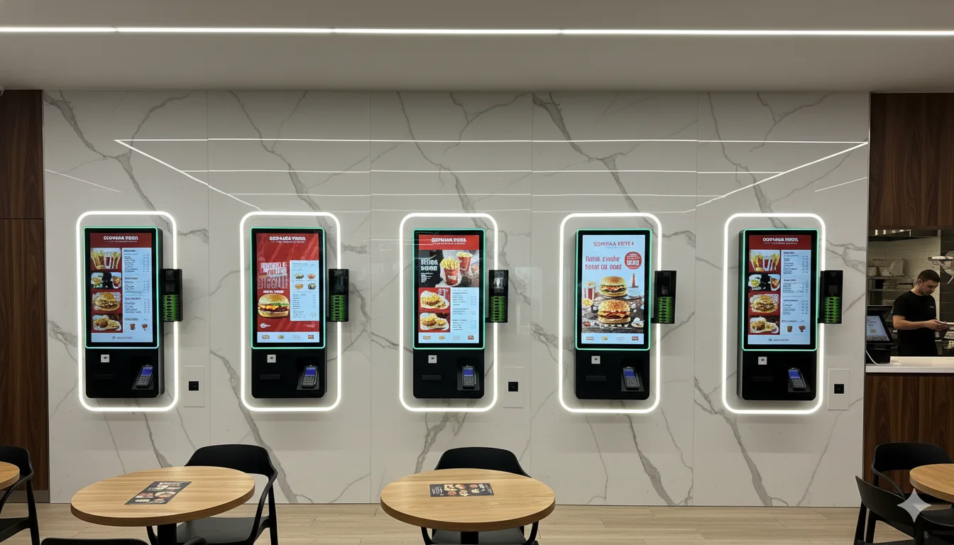
Our kiosk worked well, in France, on Windows, written in WinDev. Then the objective became clear: we were going after the American market. Translating the screens would have changed nothing. One product had to carry the identity, journey and rules of any brand, without a line of development per client.
I did not write the code: R&D built it and QA tested it. I carried the product direction, the specifications and prototypes in Axure, the design in Adobe XD and the trade-offs. Here is how the product works, piece by piece.
A kiosk looks like one product. It is really three projects in one: the application the end customer sees, the administration the brand operates, and a technical layer nobody sees but which decides everything.
Overview
A kiosk is three products in one
The customer app
What the person at the screen sees. It must respond instantly, guide without a manual and never freeze.
In practice Ten people queuing behind one hesitant customer.
Fluidity and accessibilityPart 1: the end customer's application
The first challenge comes down to two words: fluidity and speed.
Designing for someone standing up
A kiosk is not a website on a large screen. The person is standing, often in a hurry, with a queue behind them, and has never read a manual. They touch the screen with a finger, at a height that also has to work for someone in a wheelchair.
The whole design starts there. Large touch targets. The choice of language on the first screen. One decision at a time. A simple thread: welcome, choice, cart, payment, confirmation. An accessibility mode that brings the interface within reach. And payment by card, contactless or cash, without ever losing the sale.
Android, Linux, Windows, and sometimes no network
The customer application also had to survive the real world. From one client to the next the machine changes: Android, Linux, Windows, different screen sizes, different peripherals. And the network in a point of sale always fails at the worst moment.
Multi-OS
Why the same kiosk runs everywhere
Tap a layer to open it.
Components, animations and journey are the same for everyone. That is what freed the product from Windows.
That is what makes a fast response possible: the journey does not depend on a server round trip at every touch. What matters to the customer happens on site.
Part 2: the brand's administration
The second part is for another user: the operator, the head office of a franchise network, the person who has to change a price without calling a developer.
A brand is data
In WinDev, adapting the kiosk to a client meant development. That could not work with our ambition, because every brand wanted its own kiosk.
So we separated what belongs to the product from what belongs to the brand. The React components, buttons, product cards, grids and carousels, are the same for everyone. The logo, colours, images, display names and languages are configuration. A new brand does not need new code, only a new set of data.
Moving to React was therefore no matter of fashion. WinDev locked us into Windows, while a web technology could run on any hardware, connect to modern payments and be hired for anywhere.
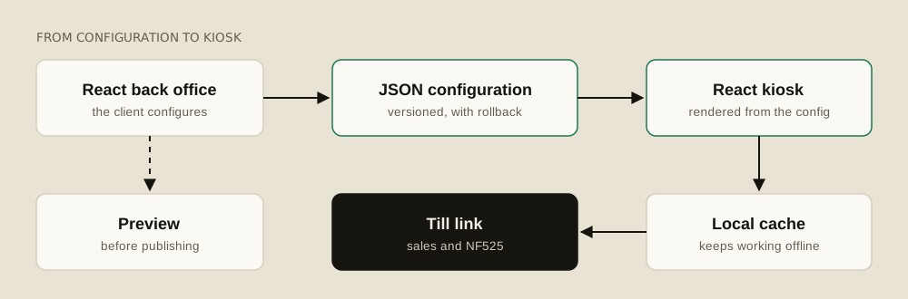
The back office writes a versioned JSON configuration. The kiosk reads it and draws itself from it. A local copy lets it carry on if the network drops, then synchronise. If a release causes a problem, we go back to the previous version.
Everything starts with the card
The heart of the CMS is a simple hierarchy. A brand owns shops, and each shop has its card. The breadcrumb on screen says so at every moment: catalogue, brand, shop, card, section.
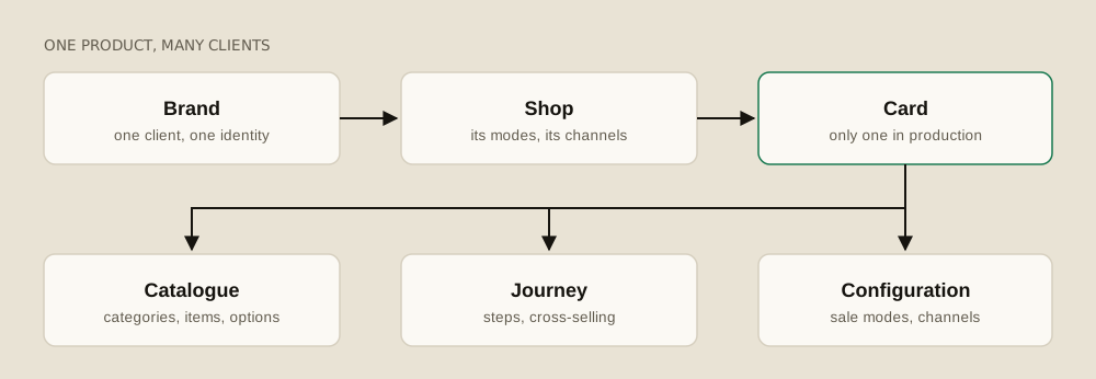
Under the card are the building blocks the client handles: categories, items, tags for filtering, options, allergens and journeys.
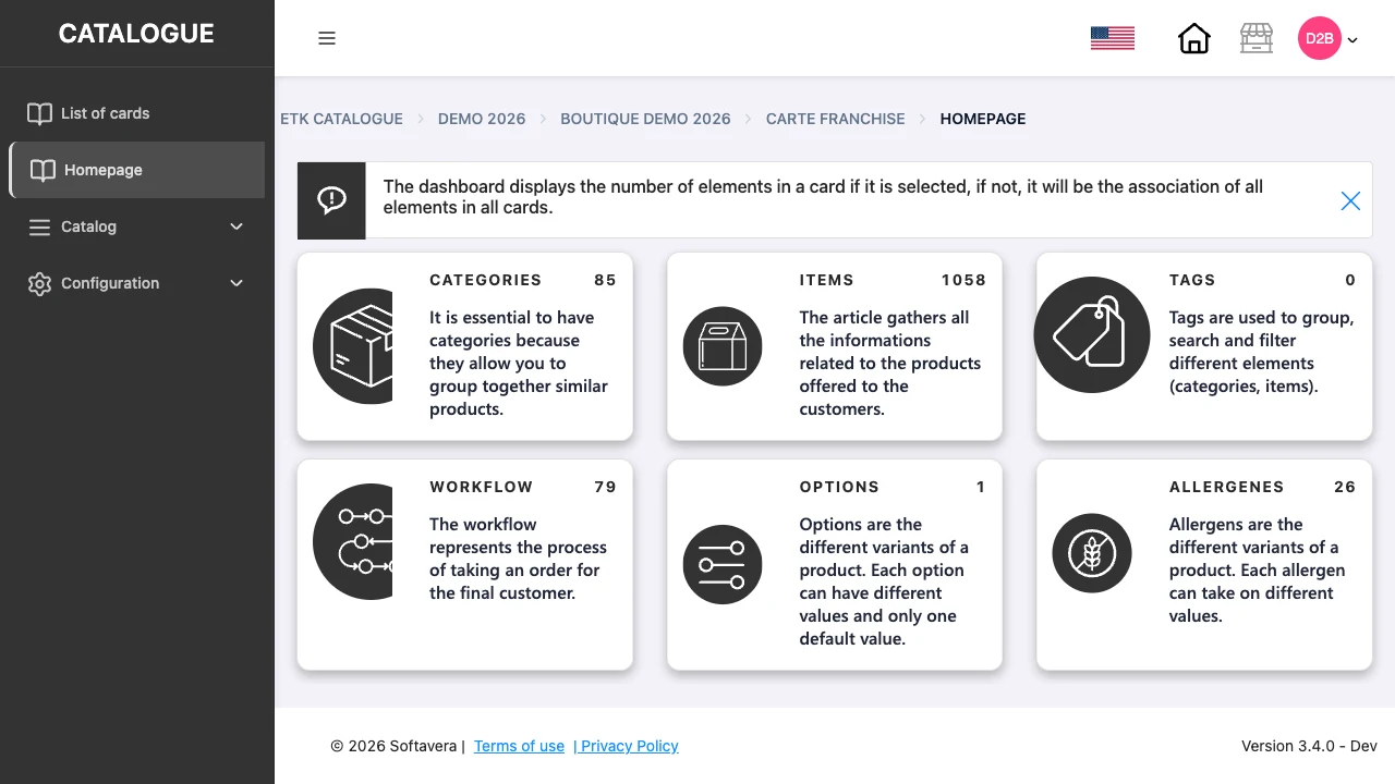
The current back office, in a demo environment.
Options are a good example: a size, several values, and a single default value. The client describes the products, and the kiosk interface follows from that description.
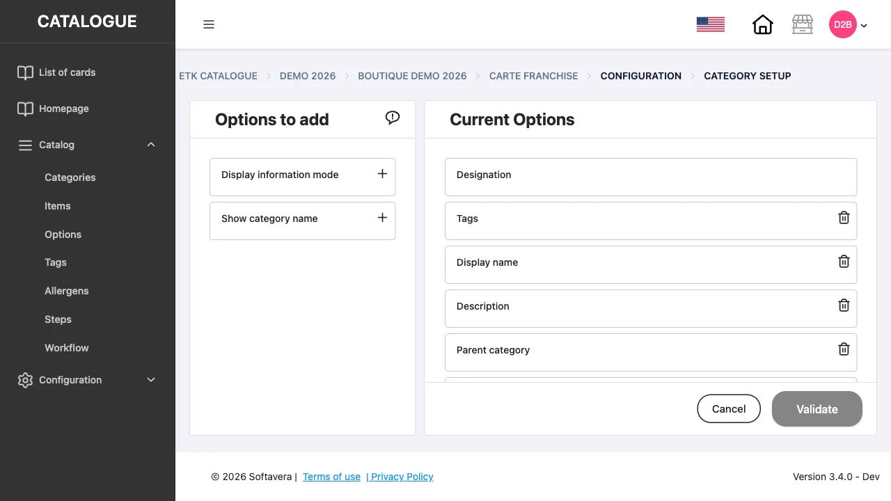
Even the back office is configurable. For a category, the screen shows the available fields on one side and the active fields on the other. Each brand only sees what it needs.
The drag-and-drop journey
This is the hardest part to design, and the most important. An ordering journey is not a page. It is a sequence of decisions, and standard content management systems do not handle that kind of logic.
So we built a visual editor. The client places and links the elements of the card, column after column, and watches the structure of the journey take shape.
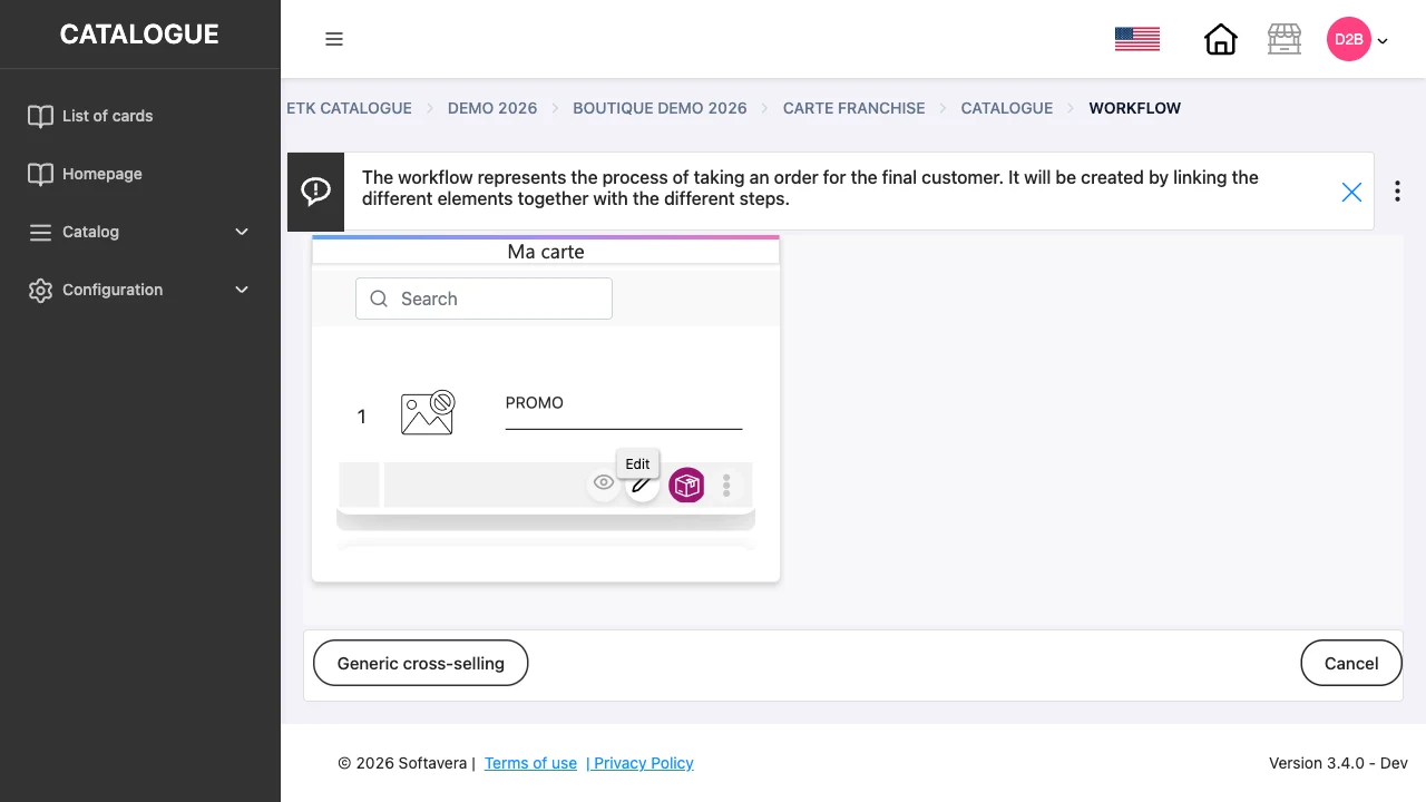
The building block that simplified everything is the step. A step is a choice offered to the end customer during the order. It can be used by several items and personalised according to the item that triggers it. So nobody recreates the same choice fifty times. You create it once, link it, and adapt it. A category can even become a step, with a clear rule on the price applied. Cross-selling works on the same principle.
Before anything is published, the client has to see what they have done. Without a preview, nobody dares to touch a kiosk in service.
Many shops, one truth
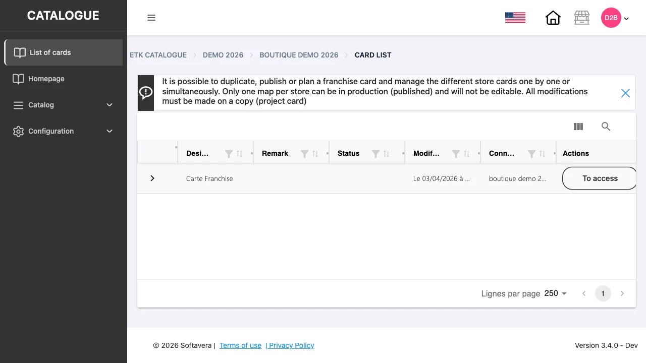
The real danger of a self-service CMS is a change in the middle of the day. So we set a strict rule, which the screen itself repeats: only one card per shop can be in production, and it cannot be edited. Every change is made on a copy.
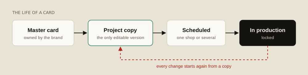
Head office can duplicate a card, publish it or schedule its release, shop by shop or across several at once. A network keeps a common base, and a shop can have its differences without breaking the others.
Where it gets complicated: the exceptions
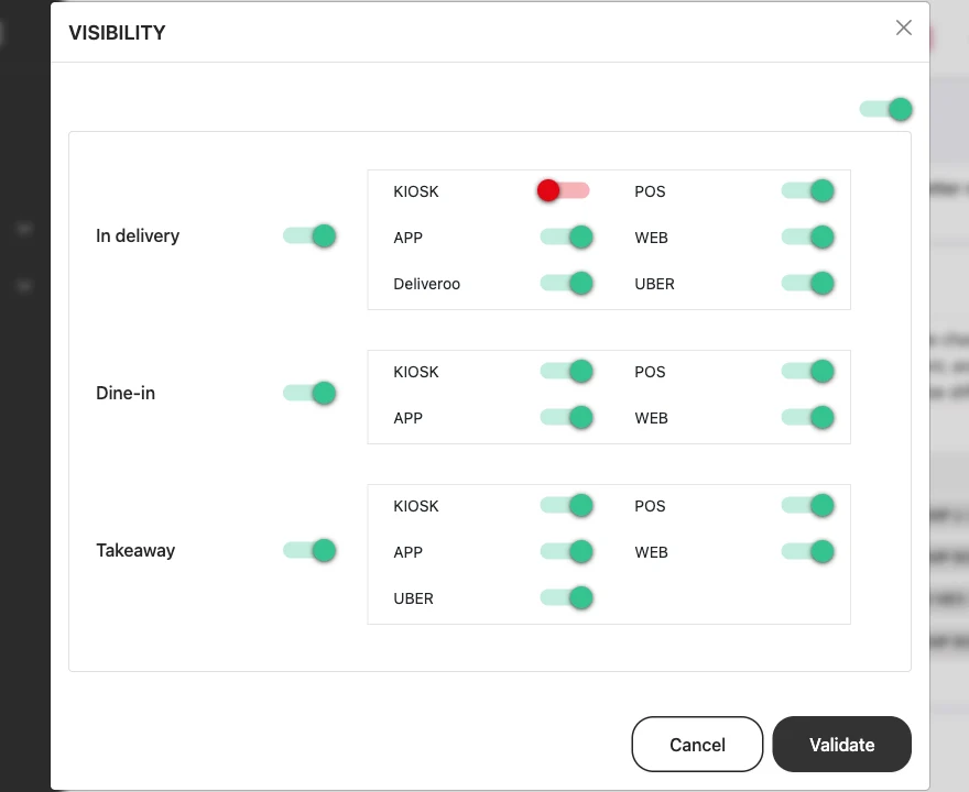
A brand is never uniform. The same item may be sold in store but not for delivery, on the kiosk but not in the app. In the demo shop there are three sale modes and seven sale channels.
We treated this as a matrix. For each item, the client switches visibility on or off by sale mode and by channel: kiosk, till, app, web, delivery platforms. One product record, and as many exceptions as needed, without duplicating it.
Part 3: payments, orders and links with tills
The third part is the one nobody sees. It is where trust is decided. A kiosk has to talk to several types of payment terminal, recover each order, pass it to the other tills and in-store screens, and never lose what has been paid.
The right question is not "does it work?". It is "what happens when it doesn't?". Pick a scenario.
Worked cases
What does the kiosk do when things go wrong?
Kiosk, midday
A meal deal, one option, paid by card.
Customer · 1/6
The customer builds the order in a few gestures.
What had to stay out of reach
That freedom only exists because the rest is locked. No setting can touch the integrity of sales required by NF525, the behaviour of payment, the link with existing tills or degraded mode. Internationally, the rules change again: in the United States, sales tax varies by state and even by city.
La Réunion, more than 9,000 kilometres away
Our first pilot client was Burger King in La Réunion, with real hardware, a real network and real customers in the queue. That is where the product truly met its constraints. If I had to do this project again, I would go to the field sooner.
The product was then deployed in very different settings, from Burger King in Réunion to Italian brands, each with its own catalogue, identity and journey, on the same code.
Client freedom only worked because the dangerous parts were out of reach. AI agents need exactly that boundary.